UI/UX Design
How to choose your color palette, catchy icons, and a sleek, overall design for your app.
UI/UX Design Guide for Hackathon Participants
Creating a visually appealing and user-friendly app can set your project apart in a hackathon. This guide will help you choose your color palette, catchy icons, and a sleek overall design for your app.
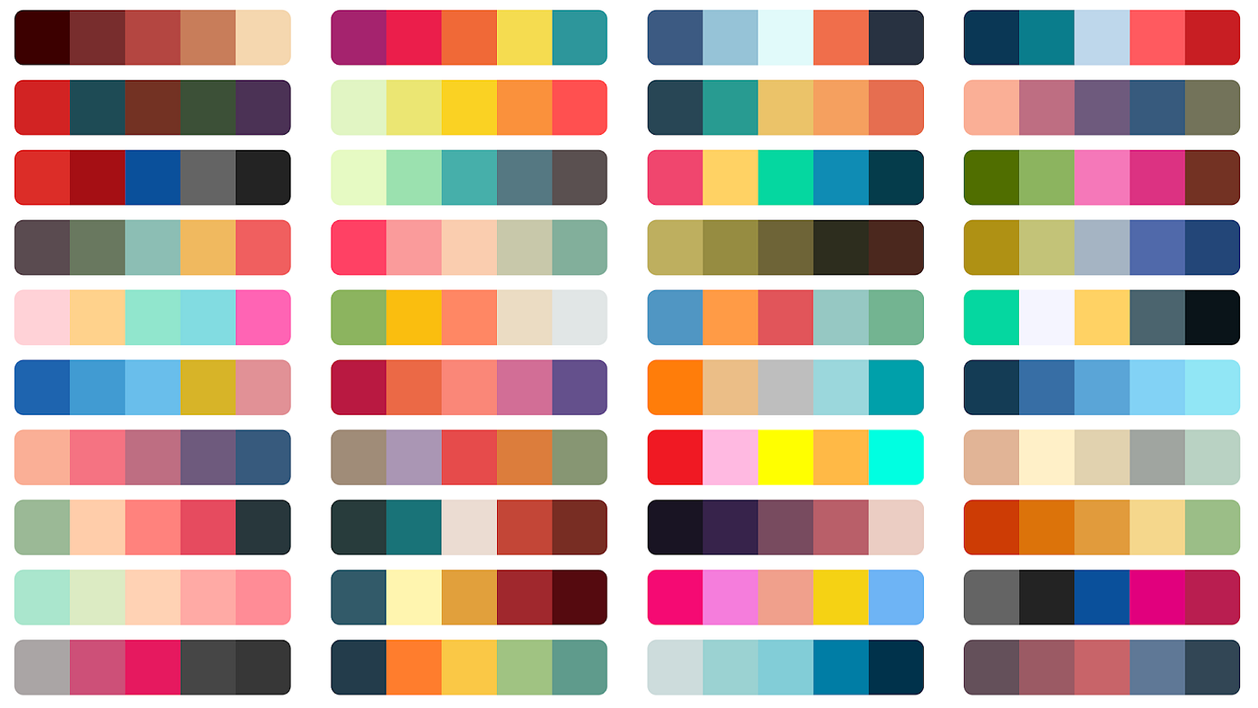
Choosing Your Color Palette

-
Understand Color Psychology: Colors evoke emotions and reactions. For instance, blue can convey trust and calm, while red can signify excitement or urgency. Choose colors that align with the message and tone of your app. For more information, check out this article by Canva.
-
Use Online Tools: Tools like Coolors, Adobe Color, and Paletton can help you generate harmonious color schemes. Experiment with different combinations to find what works best.
-
Stick to a Limited Palette: Use 2-3 primary colors and a few secondary colors for accents. This keeps your design cohesive and professional. If you need help choosing a limited palette, check out RealtimeColors.
Selecting Catchy Icons
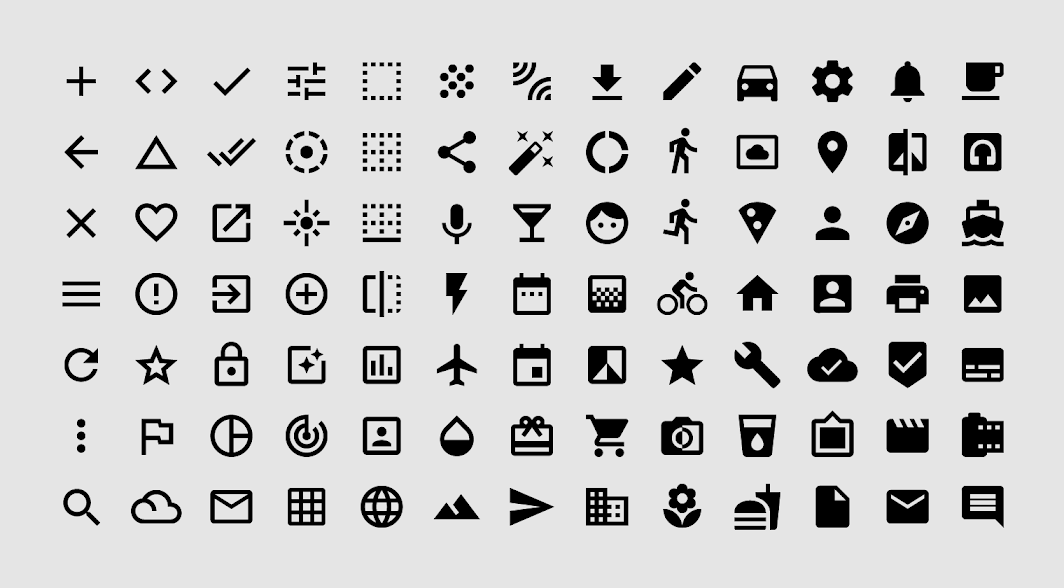
 Shown above: Material Icons
-
Use Consistent Style: Choose icons that match the overall style of your app. Whether it's flat, material, or outline, consistency is key.
-
Utilize Icon Libraries: Free resources like FontAwesome, Material Icons, and Lucide React offer a wide range of icons that you can use in your app.
-
Keep it Simple: Icons should be simple and easily recognizable. Avoid overly complex designs that can confuse users.
-
Customize When Necessary: If existing icons don’t fit your needs, use tools like Figma or Sketch to create custom icons that match your app's branding.
Crafting a Sleek Overall Design
-
Follow Design Principles: Adhere to fundamental design principles such as balance, contrast, alignment, and hierarchy. These principles ensure that your design is aesthetically pleasing and functional.
-
Wireframe First: Start with wireframes to plan the layout and structure of your app. Tools like Balsamiq, Sketch, and Figma are excellent for creating wireframes.
-
Prioritize Usability: Ensure your app is easy to navigate. Use familiar patterns and intuitive navigation to enhance the user experience.
-
Incorporate Feedback: Test your design with potential users and iterate based on their feedback. User testing can reveal usability issues you might not have noticed.
-
Use Design Systems: Implement design systems like Google’s Material Design or Apple’s Human Interface Guidelines to maintain consistency and speed up the design process.
Tools for UI/UX Design
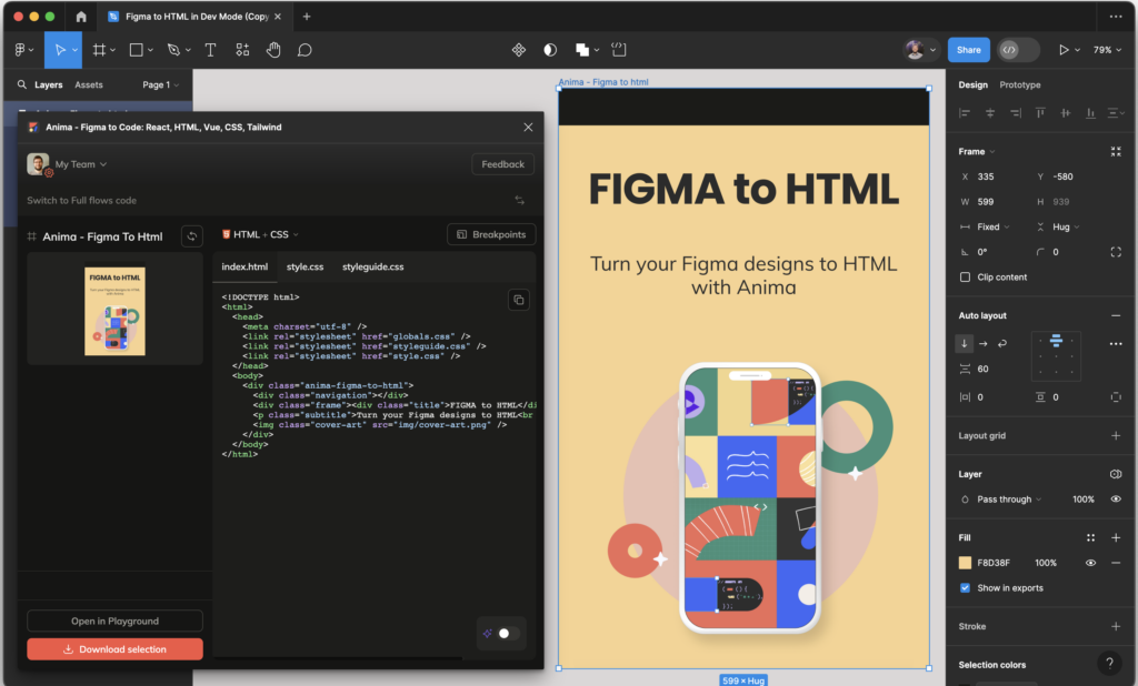
 Figma is one of the best tools for design and prototyping your app/product.
- Design and Prototyping: Figma, Sketch
- Color Palette Generators: Coolors, Adobe Color, Paletton
- Icon Libraries: FontAwesome, Material Icons, IconFinder
- Wireframing: Balsamiq, Sketch, Figma
- Accessibility Checkers: Contrast Checker, WebAIM
Takeaways
A well-designed UI/UX can significantly impact the success of your app at a hackathon. By choosing the right color palette, selecting catchy icons, and crafting a sleek design, you can create an app that is not only functional but also visually appealing and user-friendly. Use the tools and tips provided in this guide to elevate your app's design and make a lasting impression. Happy hacking!